 Justifying text
while setting metal foundry type by hand requires a bit
of attention. It's not enough to simply slip in extra
spacing where you can. To maintain good "color" for a
block of justified text, it is important to adjust
spacing between all words in a line. While this may seem
tedious at first glance, it is in reality not difficult
to do, and was in fact done for hundreds of years before
the Linotype became the choice tool of typesetting
around 1900. Justifying text
while setting metal foundry type by hand requires a bit
of attention. It's not enough to simply slip in extra
spacing where you can. To maintain good "color" for a
block of justified text, it is important to adjust
spacing between all words in a line. While this may seem
tedious at first glance, it is in reality not difficult
to do, and was in fact done for hundreds of years before
the Linotype became the choice tool of typesetting
around 1900.
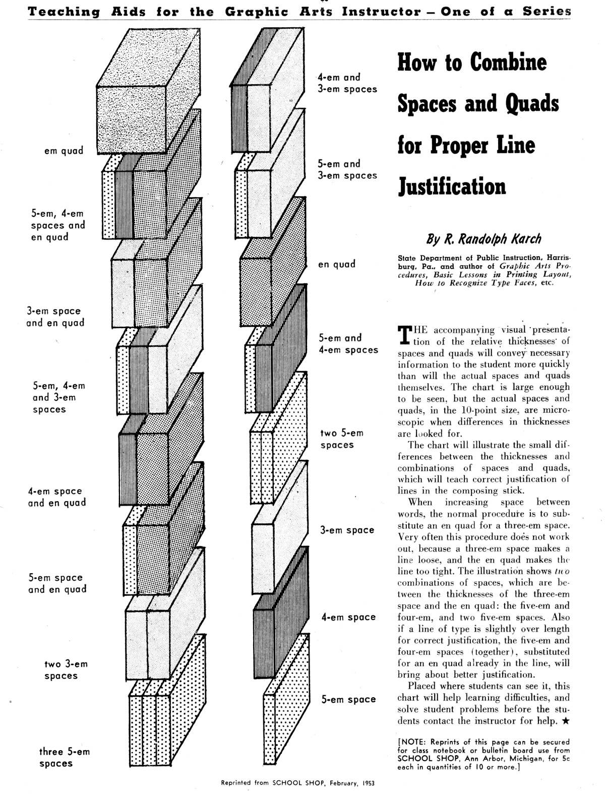
Read Mr. Karch's text below to get a better
understanding of how to combine spaces and quads for
proper line justification.
While mathematical precision would suggest that all
words have the exact same amount of spacing between
them, there are, of course exceptions. In the case of
such exceptions, let your eye be your guide, then prove
the validity of your choice with proofs of the text. |
View this industrial training video on setting type by hand
Using the Composing Stick
http://www.youtube.com/watch?v=AHrLIVeH1KM

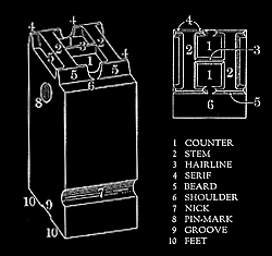
Parts of a piece of type
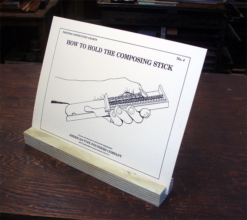
How to Hold the
Composing Stick
